Thursday, July 7, 2011

Bibliophile's House of Shelves

Oh Lordy! This house would be disastrous for my book addiction!


Link

House of Shelves

By Gilbert Mohtes-Chan, Inman News
June 30, 2011

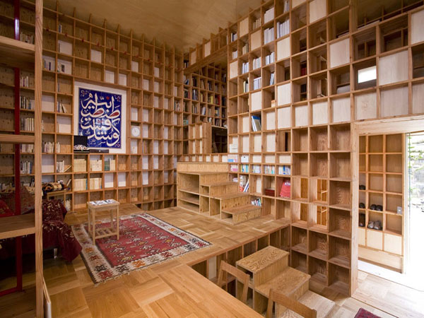
The innovative 'Shelf-pod' house in Osaka, Japan can hold 10 tons of books.
Photo: Kazuya Morita Architecture Studio

Floor-to-ceiling, wall-to-wall shelving defines a compact, 557-square-foot home in Osaka prefecture, Japan, designed by Japanese Architect Kazuya Morita.

Designed for a young historian with an extensive book collection in Islamic history, Morita designed the house with interlocking laminated pine boards that slot together to form a lattice of towering shelving units.

Every element -- from the stairs to the windows -- were scaled to the individual shelf unit, "with the aim of achieving geometrical harmony which is comparable to Islamic architecture," Morita's website notes.

The shelving had to be strong enough to support the entire house. "This is an unusual structure. I never experienced this kind of architecture," said Morita, who declined to disclose the cost to build the house. Numerous tests and experiments were run on models to ensure the structural integrity and convince city planning officials to issue a building permit. The home's exterior features a painted clay and bamboo wall, with cedar exterior wall plate. The interior is finished with plaster.

Exterior of the shelf-pod house in Osaka.
Photo: Kazuya Morita Architecture Studio

"It can support 10 tons of books," said Morita, who opened his architecture studio in 2000. And, he added, "it can survive earthquakes."

The shelving even extends into the home's bathroom, covering a wall above the toilet and bathtub.

Construction of the shelving for the "Shelf-Pod" home began in mid-2006, and the home was completed in March 2007. Morita's website details the many stages of construction, including the preconstruction of the large shelving units, which were assembled and structurally tested in a massive laboratory at Kyoto University's Katsura Campus.

He commented in a blog post that the client "was not entirely (sure) how to use this," when he saw the design. Morita also commented that he was "rather pleasantly surprised," during a visit to the home in 2008, to see how the client had furnished the home and was using the space.

A good place for knick-knacks.
Photo: Kazuya Morita Architecture Studio

Considered part of a new generation of architects, the 39-year-old Morita has wowed interior design and architecture critics with the Shelf-Pod and some other innovative and unique housing designs, including the "Pentagonal House." He noted that the Shelf-Pod was one of his most ambitious and challenging projects.

For Morita, the Shelf-Pod embodies a movement toward smaller, greener houses, and the increasing need to build more compactly in crowded big cities and retrenching suburban communities. He describes his work as a harmonious marriage of traditional and modern architecture, which incorporates sustainable materials and eco-friendly amenities. His homes blend indoor and outdoor environments and demonstrate that comfortable living can come in small spaces.

"Japanese architecture always has to be smaller. We have to live more efficiently," he said in an interview from his office in Kyoto, Japan. "Many big cities have the same problems. They are sprawling and sprawling. It's a very international situation." His smaller home designs, he said, are "very useful in China, New York, London and other big cities."


* Drool! *


Sunday, June 26, 2011

Book Related Fun

Today I'm presenting some book related fun. Enjoy.


Cool Book Storage

I'm forever on the hunt for better and more creative ways to store books.
Here are a few I have run across lately.


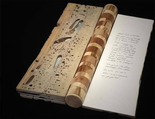
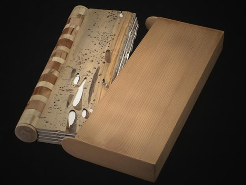
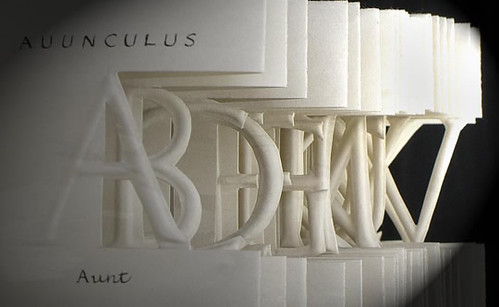
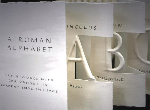
This one is both art and functional. Very Awesome!

Sunday, May 29, 2011

St. Therese and Healing of Broken Hearts

Words of St. Therese

Therese Palette Lisieux

Therese's painting palette

If a piece of canvas painted upon by an artist could think and speak, it certainly would not complain at being constantly touched and retouched by the brush, and would not envy the lot of that instrument, for it would realize it was not to the brush but to the artist using it that it owed the beauty with which it was clothed. The brush would not be able to boast of the masterpiece produced with it, as it knows that artists are not at a loss; they play with difficulties, and are pleased to choose at times weak and defective instruments.

I am a little brush which Jesus has chosen in order to paint His own image in the souls entrusted to my care. An artist does not use only one brush, but needs at least two: the first is the more useful and with it he applies the general tins and covers the canvas entirely in a very short time; the other, the smaller one, he uses for details.

Our Prayer

Good Jesus, Artist of our Souls, we need Your healing touch. Disappointments, disillusionment and betrayals have discolored our soul. We are brokenhearted because we expect so much; we sense the the beautiful portrait of our life has been ruined. We have lost faith in ourselves as Your dwelling place and Your image – as the canvas where You are painting beauty.

We don’t let your inclusive and colorful love define us. We let hurts and anger harden our hearts, and transmit them to others. Our self-pity explodes in self-destructive ways or in violent attitudes, judgments, words and silence toward others. In the heavy emptiness of our hearts, we let power, privilege, prestige and plenty define us and justify our less-than-true selves.

Like St. Therese, help us transcend the heartbreaking disappointments of life and embrace the holy opportunities that are Your grace everywhere. Touch our brokenness, Lord Jesus. Your suffering and death opened You to God and the salvation of all. Transform the sufferings of our broken hearts into a deeper longing for You and a clearer vision of life in faith, with You as the Artist.

We ask You this, through the intercession of St. Therese, who teaches us confidence and trust in Your love.

Article by Fr. Bob here.

Monday, May 9, 2011

Advice for New Students

What words of advice would you give to freshmen starting college?


*I would tell them to get the hell out of their own way and leave their pride at the door!!!


*Listen to everything your teachers tell you and sift the information respectfully.


*ALWAYS, ALWAYS give another person the benefit of the doubt.


*Don’t be so quick to judge any fellow student OR any teacher.


*Show your teachers that you are personally, not just academically interested in what they are teaching and you will gain an ally who will bend over backward to help you out when you need it.


* Send heartfelt thank you notes to teachers that have really helped you out, personally or academically. If YOU don’t tell them that they made a difference…then WHO will?

*Never, never, never, never, never, never, never give up!

Dead End Window

There’s no one like you, but everyone’s like me.

We all like different things and a

Coal-black diamond Democracy.


We study humans and the

Misunderstanding of an inquiring mind.

Something more and

Something like a sneer are kept

Under lock and key.


I’ve been

Surviving inches away from life

Like a perpetual bad hair day

That’s my death’s story.


Interior castles crumble singing a

Song for the broken.

I believe in love and old fashioned responsibility,

But what would I know about that.


Here's my life lived in whole years.

Sanctuaries are quiet even as

A million voices scream for

One more round.


Is life an educated guess or

Is the answer in the footnotes?

The next big thing is often

Foolish.


By the way,

Who is the hegemonic “they”?

Anywhere But Here in this Weak Want Ad

A one way window is

The opposite of intellect.

There’s no room to

Fall down under a

Money tree on a rainy day.

Let go as hard as you can.

I need you to love me like I need

A lead boomarang.


Enough with this sappy

Porcelain Hearted simplicity.

Take me away from this mediocre

Yet candycoated Eden-apple of

Emo politics.


Practicing Surrealism is Apples

Practicing Surrealism is Apples

If kiddies pop frogs,

such is an icier situation than ours.

Podium dogs yawn and sigh.

Their apathy outdoes our activism.

The gin died and fluency was laid skilfully aside.

This relic is a burr in my ducts, too rich for my downturn.

A choleric chorus howls with vigor,

jaded as fog and with as much worth as a fib.


-Anna Truckey

The Deja Vu of A Blind Man

A poem my sister and I wrote together a few years ago. Enjoy.


The Audience Does Half the Work

(Though I Get All the Credit)

This is The Deja Vu of A Blind Man

Falling Down in a Tomb Of Secrets.

Sip life, like Wraiths within Hymns.


Your Skull is Red in

these Sketches Of Pain,

Like a double fast Ice Cream Coma.


When Tears Roll Down; Don't Drink That Water.

Me and My Big Ideas are in Love With

Humdrum and Humble Apologies.


I Choose You The Way You Are,

Ashes to Ashes, Always in the Past.


Call Me Mellow, Quiet Ones,

Everybody hates your Happy Endings.


The Size of your Sorrow is the

Closest Thing to Who You Are.


My tries bend with mirth as Java fuels the idle Earth.


Monday, April 25, 2011

The MOST Awesome Table for Books EVER!!!


OMG, OMG, OMG!!!!!!!
I want one sssssssssssoooooooooooooooooo badly.


http://thisiscolossal.com/2011/04/customized-book-side-tables/

Friday, April 1, 2011

A Twist on Book Arts

Some books are so unique as to be almost from a different reality, yet other books are disposable enough to be turned into...art:


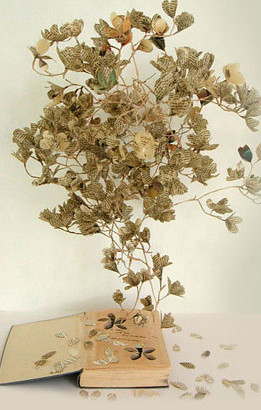
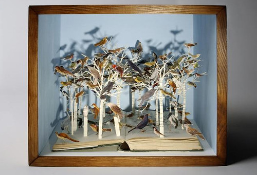
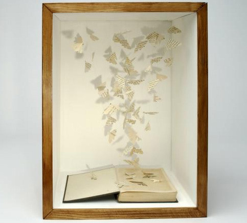
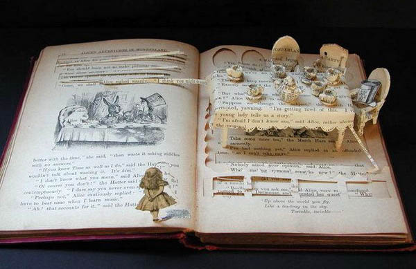
Sue Blackwell turns books into sculpted memories

The artist' website calls it a book-cut sculpture, an ephemeral and highly personal way to convey a message; the artist compares it with "receiving a marked-up copy of a book from a friend. It's like turning books into memories".

A Secret Garden:


Birds of the Open Forest:


A Quiet American:


(images by permission of Sue Blackwell)


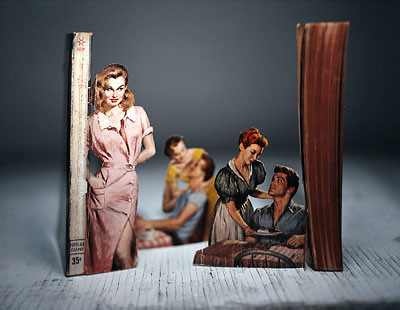
Thomas Allen gives an extra cutting-edge to pulp fiction

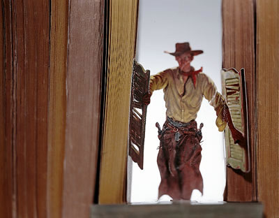
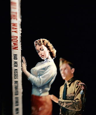
The action of various pulp novels, under the creative touch of Thomas Allen, literally jumps from the gaudy covers into reality. The carved figurines of villains and damsels in distress battle each other and pose dramatically in three dimensions. You be the judge if it enhances the contents within.


This might leave you cold if you don't care much for vintage paperbacks, or might leave you all hot & bothered, if you are a collector and can't stand the sight of perfectly good collectibles being destroyed for the sake of art. In any case, enjoy a clip of a dramatic chipmunk (oh no, I finally linked to it, didn't I?), and lets move on to the actual examples of the modern book-binding art.


Creative Publishing

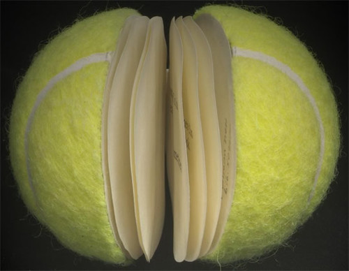
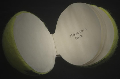
If you misplaced one of your golf balls, chances are, your wife is reading it:


Fancy wood cover, and more:


Almost like a Hallmark card, very pretty:


Again... this stuff was stolen from blog "Dark ROasted Blend"

Book Autopsy

A Good Potboiler: what makes a book tick -

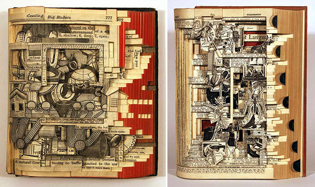
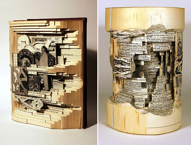
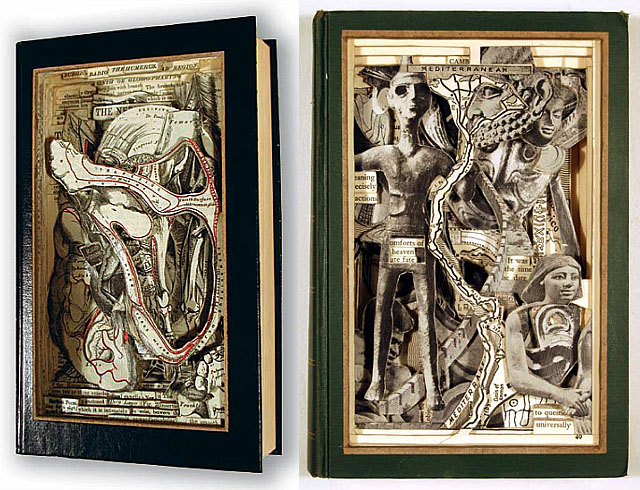
Study the inner workings of a plot and characterization in this incredibly open and visual way: books dissected and enhanced by mixed media - designed by Brian Dettmer.


Some call it "Book Autopsies"; I'd call it "hack writing, with 3D illustrations". The anatomical "content" looks especially interesting:


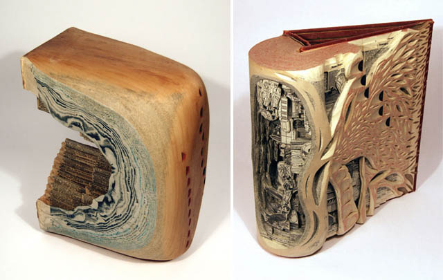
Other work from Brian Dettmer includes some kind of fossil formations, with books revealed in them:


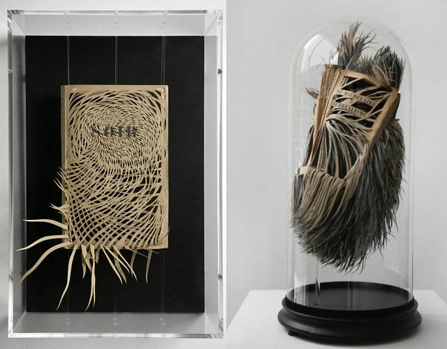
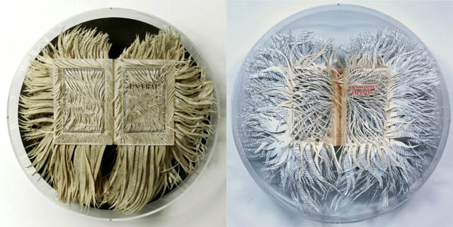
Scalpel Art has to be even more precise... But the book itself is basically trashed. Georgia Russell is responsible for this irresistible "carnage":


It feels like these books have to be contained, otherwise they would explode in streams of wild tangle all over the room:


Other really awesome book art: from Su Blackwell -


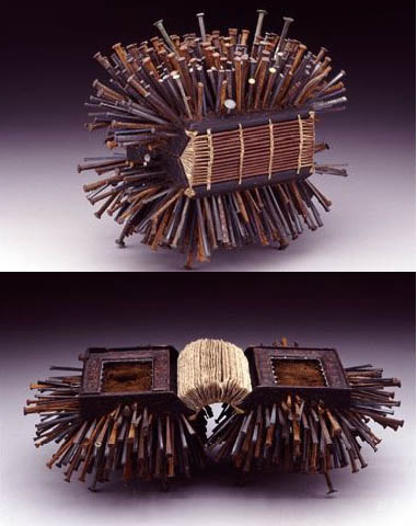
"The Book of Nails" by Daniel Essig:


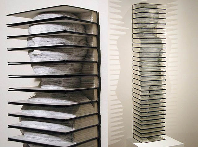
Profile of a really well-read individual

Aaron Packer in his gallery shows this wonderful book sculpture:


Thank you "Dark ROasted Blend"

Thursday, March 24, 2011

*DROOL*
*DROOL!*

Form and function! Wonderfully conceived!
If only I had the cash. :)

Desk by: MerrickCarpentry

http://www.etsy.com/view_listing.php?listing_id=24258825


The Most Practical Bookcase EVER!

Ok. I love books.
Second to books are the cases that hold them.
Add that to good design and I'm hooked.
Take a look.


http://www.apartmenttherapy.com/ny/shelving-storage/staircase-ladder-shelving-unit-by-danny-kuo-061999

Tuesday, March 22, 2011

Bookshelves

Doing a Google search for bookshelves turns up some interesting things.

This top one is made of old National Geographic magazines. Way cool!